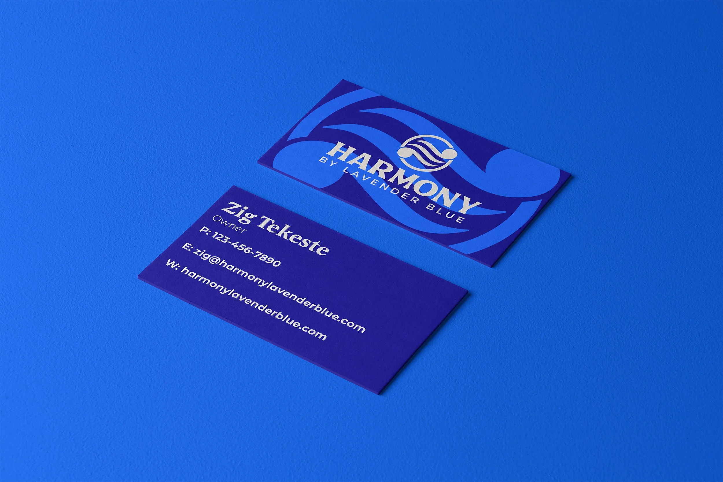
HARMONY
Services: Brand Strategy, Visual Identity
BY LAVENDER BLUE
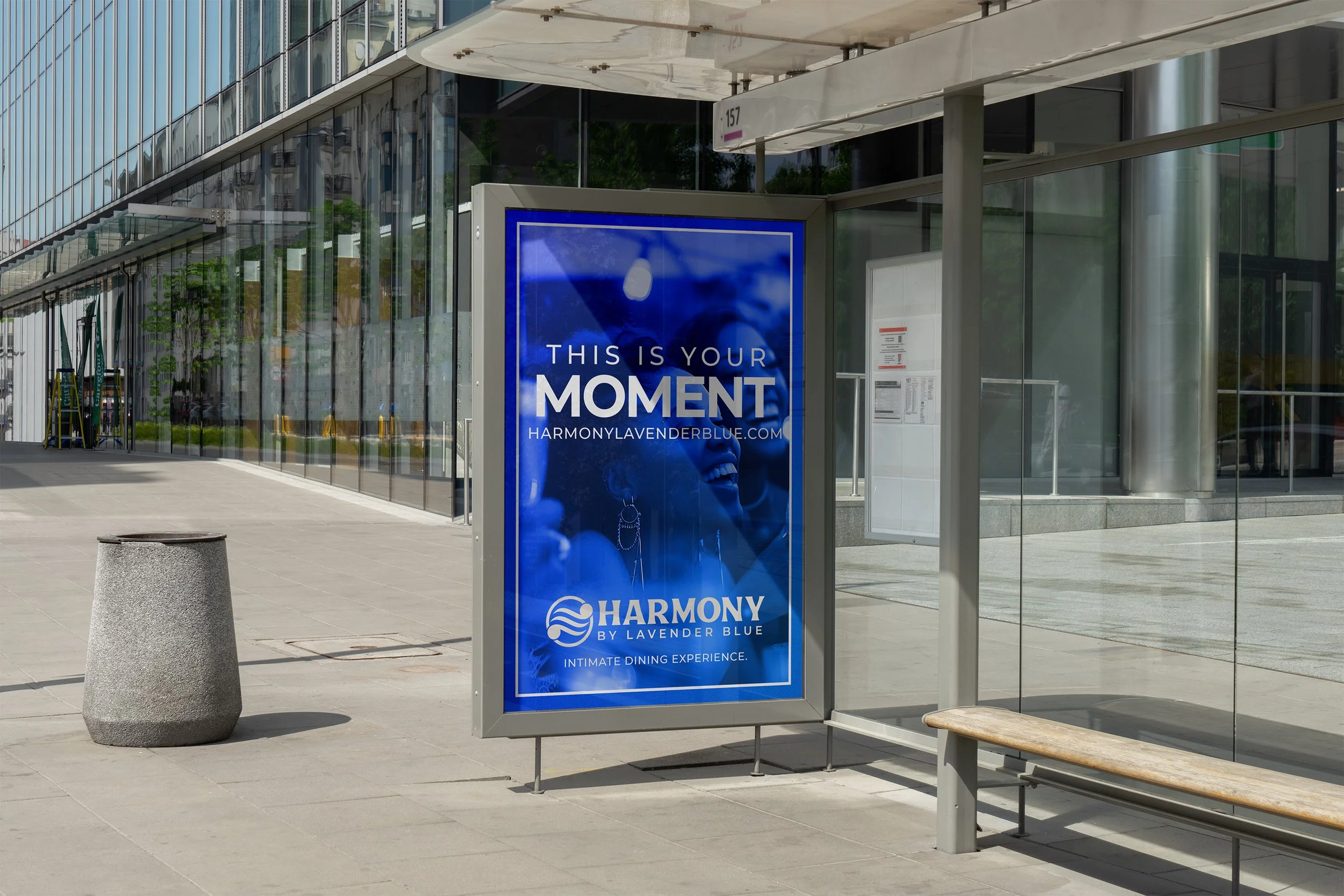
Standing as the next evolution of the beloved “Lavender Blue” restaurant and jazz club, Harmony is here to elevate the customer experience to the next level.
Harmony gracefully combines high-end dining, intimate entertainment, and an invigorating sports lounge to create the ultimate all-in-one experience for not only Los Angeles locals, but as an independent global icon.
We were tasked with creating the branding and visual identity for Lavender Blue’s next venture into the dining and entertainment scene.
EMBRACE THE SOUND.

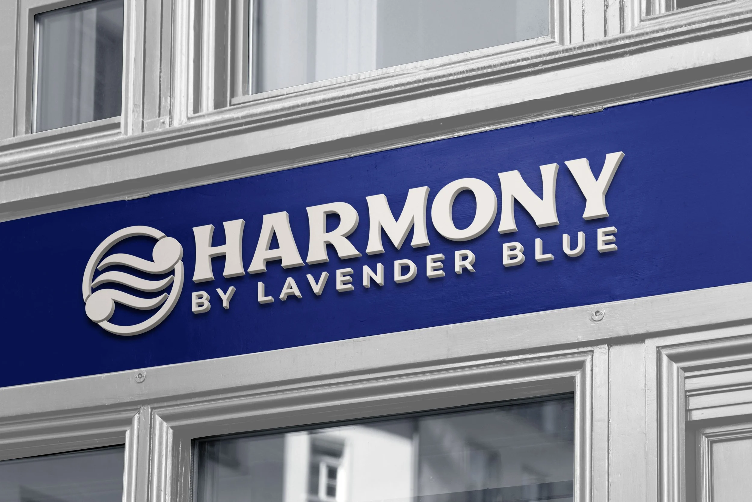
When it came to creating the logo design for Harmony, this was one of our most challenging projects yet. We were tasked with creating a symbol that gracefully combined the brands 3 core services: Dining, Entertainment, and Sports.
However, combining all 3 varied ideas into one uniform symbol was next to impossible. So instead, we took a more unique approach.
What do a vibrant dining scene, an intimate music venue, and energetic sports lounge all share in common? Sound. Ambience. Community.
With this new found discovery, we created a unique and memorable mark that gracefully combines the brands overall themes of ambience, community, and trinity. Thus, the Harmony logo was born.


A VIBRANT EXPERIENCE BROUGHT TO LIFE.
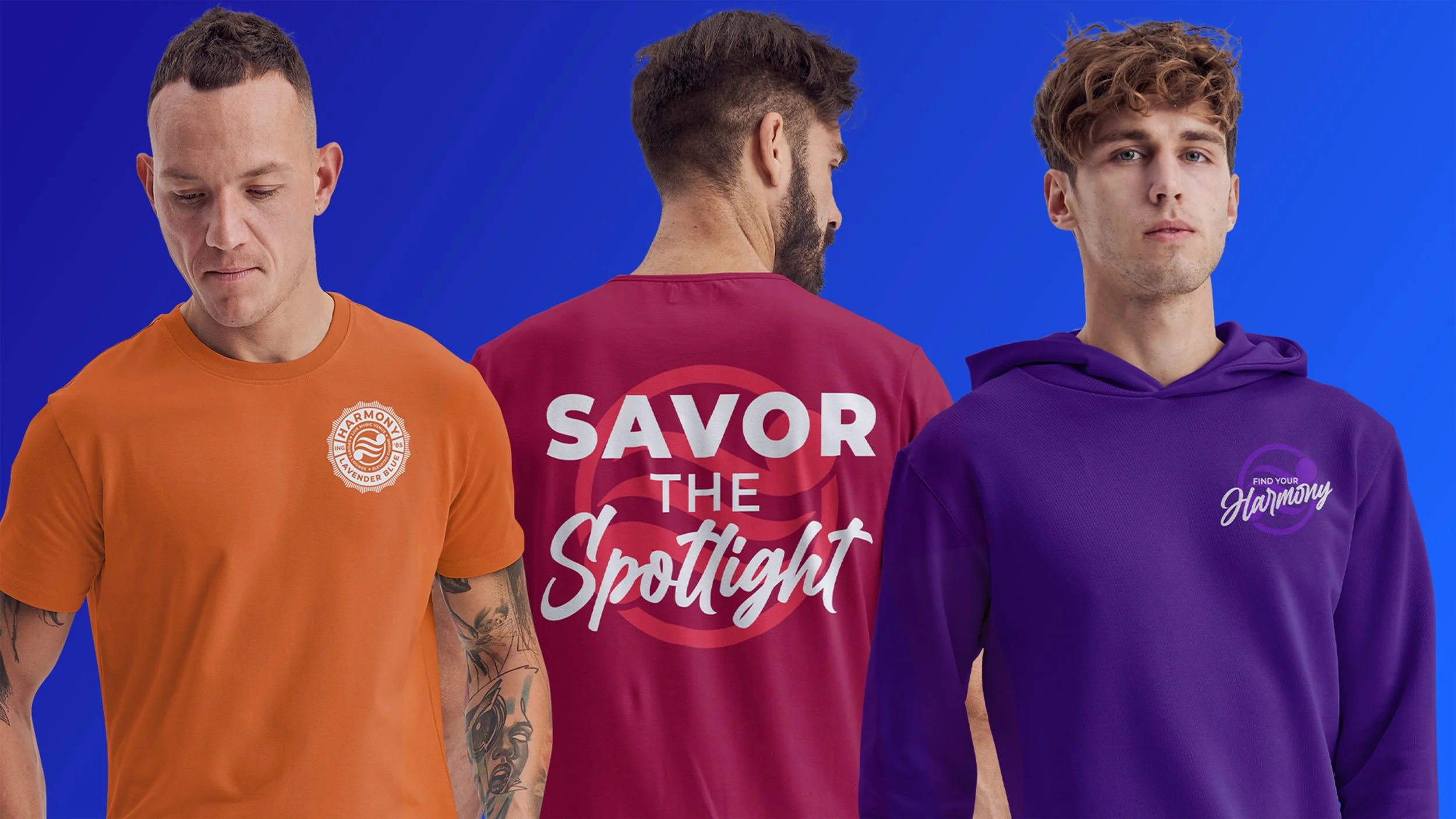
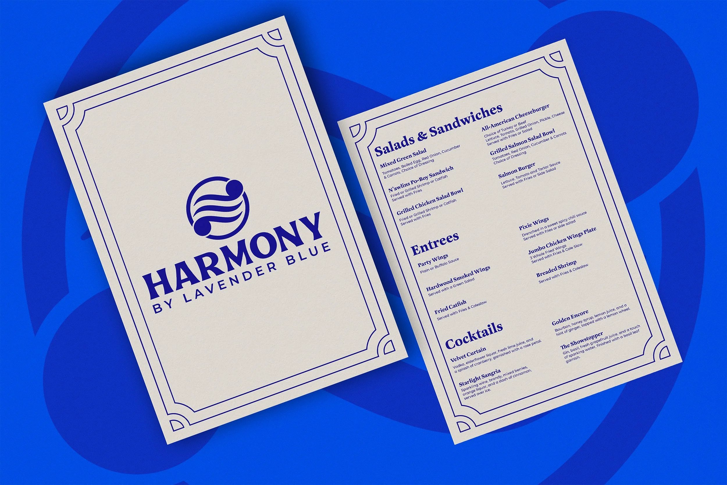
We knew from the start that the Harmony brand needed to be bold, modern and carry a small level of sophistication. One of the main functions of the brand identity is the unique color palette. Each brand color represents different services that Harmony offers.